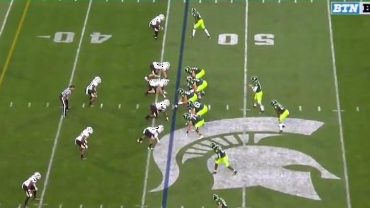
VIDEO: Michigan State's Disgusting New Alternate Uniforms Somehow Look Even Worse on the Field
By Mark Powell

Michigan State's alternate uniforms look more like something Oregon would've turned down, but yet here we are in Week 2 and the Spartans insist on flashing neon across our television screens. While we've previously made fun of this atrocious choice, much like a 90's Disney Movie, it looks even worse in live action.
Turns out those Michigan State alternates don't look any better on TV. ?pic.twitter.com/R2PuiPemSw
— Sporting News (@sportingnews) September 8, 2019
Worse pants have not been worn, not to mention the obnoxious 'Michigan State' block lettering across the front of the jersey. Even should the Spartans manage a victory over Western Michigan (which we assume they will), they'll still be taking a giant L from the fashion police, which I am conveniently a member of.
Tonight is the night for the #MichiganState alternate jerseys. pic.twitter.com/RKwRSM3bvZ
— Rico Beard (@RicoBeard) September 7, 2019
There is nothing uglier to be worn on the gridiron. Get these out of my face.